Let's appreciate his work http://www.artpad.org/ before we get in.
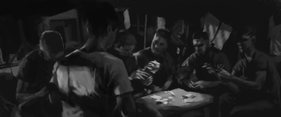
minimal color usage but it says exactly what is needed, captured precisely, nothing extra.
Process and technique:
a. get reference for about 3-4 hr, not too much. Find things that are relevant for the painting. ( encourage us to keep and organize reference library)
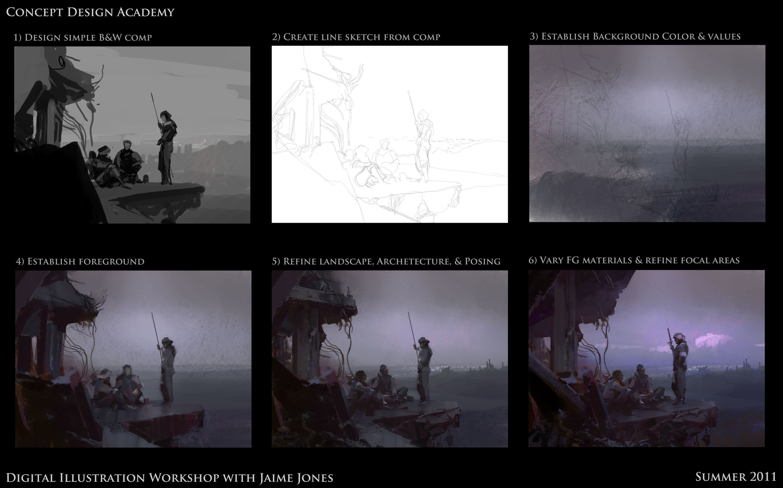
b. sketch > scan> very simple grayscale lay in for values read. Start a new one with color and check the grayscale value once in a while.
c. painting process: start with simple shape > more complex > simplify.
d. Jaime paints like using real gouache. Yes custom brushes, but the process of doing it is very traditional. Minimal layer usage, only foreground, background. All in normal layer, normal mode brush, very minimal photo usage on the painting itself too.
True master.
Colors:
He started with colors that I rarely use, like bright azure blue in a moody, melancholy painting. Big contrast with darker grayish color around it but not overwhelmed . He studied a lot on old master oil painting. impressionist like Monet, more expressive kinda painting.
Think about color as temperature.
Play with color vibration (complimentary color, refer to picture above- warm pink and cold blue in the sky) , temperature shift.
Brush strokes:
-brush strokes say something, use brush stroke to describe the story.
-He prefers to use minimal to express a lot. One stroke to tell material and form.
( think at this time he was giving a stroke on a chrome helmet, the highlight)
Shapes:
How shapes read and relating to each other. negative and positive shapes. break down of big, medium and small shapes.
Lastly: Know your priority and fight to maintain them. Ask yourself what is the focus of the painting.

